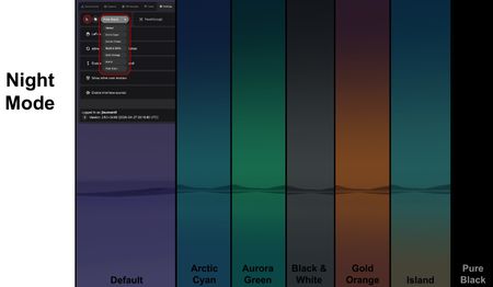
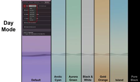
Main Panel
The Main Panel is the central interface for managing structures, ligands, workspaces, users, and settings in Nanome v2. It is accessed via the Wrist Menu and is personalized to each user in the session. The Main Panel contains five tabs across the top: Components, Ligands, Workspaces, Users, and Settings.
Additional panels are accessible from the edges of the interface, and are documented separately:
- Scenes Panel — Manage scene views within a workspace.
- Sequence Panel — Browse and select from the amino acid sequences of loaded structures.
- Tools Panel — Pointer, Measurement, Selection, Builder, and Torsion tools.
Components Tab
The Components Tab is where you manage all loaded structures and their visual representations.
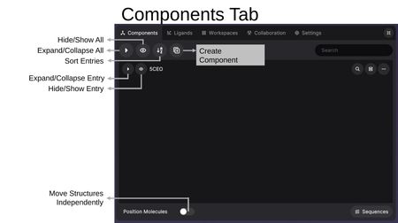
Toolbar
The top toolbar provides global controls:
- Expand/Collapse All — Toggle all entries open or closed.
- Hide/Show All — Toggle visibility of all structures at once.
- Sort Entries — Reorder entries alphabetically.
- Create Component — Create a new custom component from a selection.
- Search by Keyword — Filter entries by keyword.
- Expand/Contract Menu — Resize the menu panel using the icon in the top-right corner.
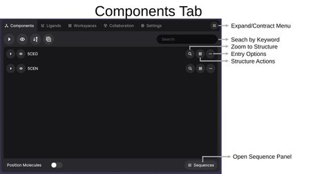
Each entry row has its own set of controls:
- Expand/Collapse Entry — Show or hide the components within an entry.
- Hide/Show Entry — Toggle the visibility of the entry in the 3D view.
- Zoom to Structure (magnifying glass) — Center the view on this structure.
- Entry Options (clipboard icon) — Access the Structure Actions menu.
- More Options (...) — Rename or delete the entire entry.
At the bottom of the panel, Position Molecules allows you to move structures independently when toggled on, and Sequences opens the Sequence Panel.
Entries and Components
Video: Load Structures, Invite & Follow from XR
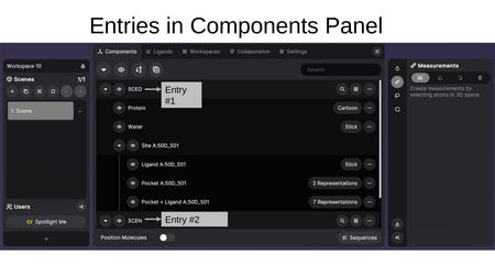
Structures are organized as entries (e.g., PDB codes like 5CEO, 5CEN). Each entry contains components, which are sub-selections of the structure with their own representation settings.
From within XR, structures are loaded by PDB code directly from the RCSB. To load other file types, use the Nanome Web app, which accepts the full range of supported file formats — the workspace then syncs to your XR session.
A Nanome workspace on its own cannot load some formats directly. Files such as .bcif, .mcif, .sd, .mol, and .mol2 — among others — require a MARA tool that supports them. See Supported File Formats for the full breakdown.
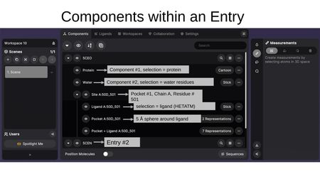
For example, an entry might contain:
- Protein — displayed as Cartoon
- Water — displayed as Stick
- Site A:50D_501 — a binding site group containing:
- Ligand A:50D_501 — the ligand, shown as Stick
- Pocket A:50D_501 — the 5 Å sphere around the ligand
- Pocket + Ligand A:50D_501 — combined view with multiple representations
Representations and Color Options
Video: Changing Molecular Representations
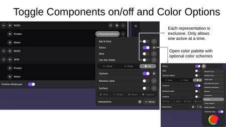
Clicking the representation button on a component opens the representation panel. Each representation type is exclusive — only one atomistic representation can be active at a time per component. The color palette icon opens color scheme options.
Atomistic Representations:
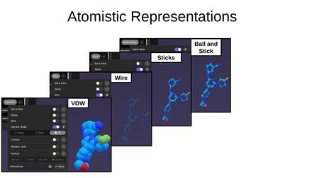
- Ball and Stick — atoms as spheres connected by sticks
- Sticks — bonds shown as sticks with no atom spheres
- Wire — thin lines representing bonds
- VDW (Van der Waals) — space-filling model showing atomic radii
Additional options include hydrogen display modes: None, Polar, or All.
Macromolecular Representations:
- Cartoon — secondary structure ribbons (helices, sheets, loops)
- Residue Label — labels for each residue
- Surface — molecular surface with four density levels:
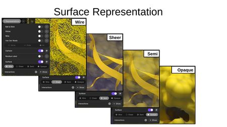
- Wire — wireframe mesh surface
- Sheer — transparent surface
- Semi — semi-transparent surface
- Opaque — solid surface
Interaction Types:
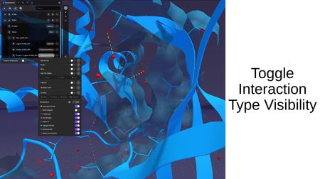
When interactions are computed between structures, you can toggle the visibility of individual interaction types: Hydrogen Bonds, VDW Clashes, π Stacking, Salt Bridges, Cation-π, Halogen Bonds, Hydrophobic, and Metal Coordination.
Color Schemes:
The color palette provides schemes including Element Type, Residue Type, Chain Name, Secondary Structure, Potential Interactions, BFactor, Occupancy, Uniform, Chain Instance, and Model Instance. A "Carbons only" toggle applies the color scheme to carbon atoms only while preserving element colors for heteroatoms.
Structure Actions
Clicking the Entry Options button on an entry opens the Structure Actions menu with the following options:
- Align proteins to this — Align other structures to this entry. Select target entries and specific chains (All, A, B, etc.), then click Align. After alignment, RMSD values are displayed between the entry and each aligned row.
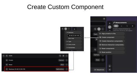
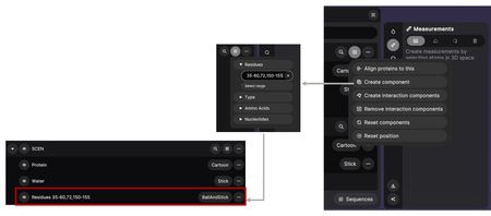
- Create component — Create a custom component by specifying residue ranges, types, amino acids, or nucleotides.
- Create interaction components — Compute interactions between structures. Choose between Polymer-Ligand and Polymer-Polymer modes, select the target entry, and click Create. This generates Cross-Entry Components showing interactions and pocket regions between the selected structures.
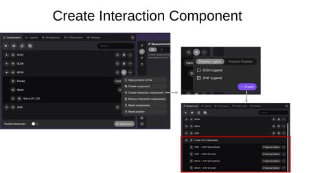
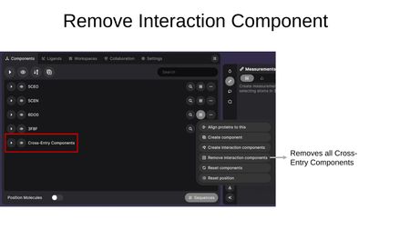
- Remove interaction components — Removes all Cross-Entry Components from the workspace.
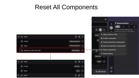
- Reset components — Removes all custom components and restores entries to their default component breakdown (e.g., Protein + Water).
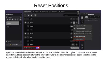
- Reset position — Returns a structure to its original coordinate space. This is useful if Position Molecules was toggled on and a structure was moved out of its original position.
Entry More Options
Video: Building Custom Components
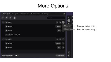
Clicking the (...) button on an entry provides:
- Rename — Change the display name of the entire entry.
- Remove — Remove the entire entry from the workspace.
Ligands Tab
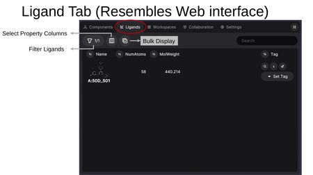
The Ligands Tab contains the Ligand Table, a spreadsheet-style view for viewing, rating, and managing ligands across all loaded structures. The table resembles the ligand table in the MARA web interface.
Toolbar
The toolbar at the top of the Ligands Tab controls what the Ligand Table shows:
- Filter Ligands — Filter the ligand list by criteria.
- Select Property Columns — Choose which properties to display as columns (RDKit-calculated properties and SDF metadata from source files).
- Bulk Display — Simultaneously display multiple models from a multi-model file.
- Search — Search for a ligand by name.
Ligand Table
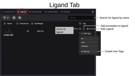
Each ligand row displays the 2D structure preview along with selected property columns (e.g., Name, NumAtoms, MolWeight). Per-ligand actions include:
- Zoom to ligand (magnifying glass) — Center the 3D view on this ligand.
- Add annotation (i) — Add notes or annotations to the ligand.
- Edit Ligand (pencil) — Open the ligand in the Builder Tool for editing.
- Set Tag — Assign tags such as Hit, Lead, or Candidate. You can also create new tags via "Edit list".
Property Columns
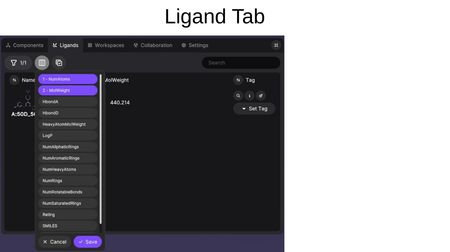
Available properties include RDKit-calculated values (NumAtoms, MolWeight, HbondA, HbondD, HeavyAtomMolWeight, LogP, NumAliphaticRings, NumAromaticRings, NumHeavyAtoms, NumRings, NumRotatableBonds, NumSaturatedRings, Rating, and SMILES) as well as any SDF metadata from the source file.
Workspaces Tab
Video: Load Structures, Invite & Follow from XR
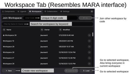
The Workspaces Tab allows you to manage, create, and navigate between workspaces. The interface resembles the MARA web interface.
Features
- Join Workspace — Enter a unique 8-digit workspace code to join another user's workspace.
- Search for workspace by keyword — Filter workspaces by name or owner.
- Workspace List — Shows all accessible workspaces with Name, Owner, and Modified date. Each workspace has an options menu (...).
- + New — Create a new workspace.
- Load for All — Go to the selected workspace and bring everyone in the current workspace with you. Users will be prompted to assign permissions if they don't already have them.
- Load — Go to the selected workspace for yourself only, leaving other participants in their current workspace.
Projects
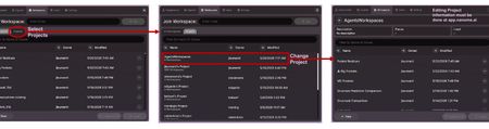
Workspaces can be filtered by project. Change Current Project opens the project list, where Select Projects filters the workspace list to a single project. Each project row shows the project name, the number of workspaces it contains, and its owner.
Editing project information must be done at app.nanome.ai.
Users Tab
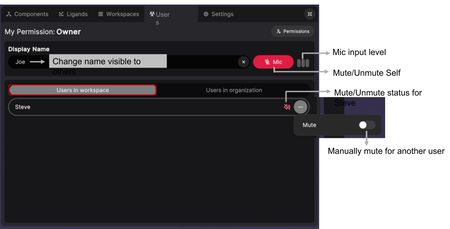
The Users Tab manages users, audio, and permissions within a workspace. Your own permission level for the current workspace is shown at the top as My Permission.
User Settings
- Display Name — Change the name visible to other users in the session.
- Mic — Mute or unmute yourself. The mic input level indicator shows when audio is being transmitted.
Users in Workspace
Lists all users currently in the workspace. For each user you can:
- View their mute/unmute status.
- Click (...) to manually mute another user.
Users in Organization
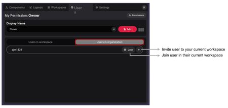
Lists all users in your organization who are currently online. For each user you can:
- Join — Join that user in their current workspace.
- (+) — Invite that user to your current workspace.
Permissions
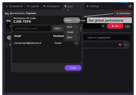
Click the Permissions button (top-right) to open the permissions dialog. The dialog shows the Workspace Code and provides:
- Global permissions level — Set the workspace to None, Viewer, or Editor for anyone with the code.
- Add people by email — Invite specific users by email and set their permission level (Editor or Viewer). This must be an exact email match.
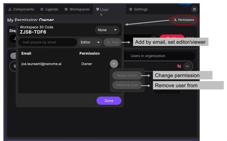
For individual users already in the workspace, click (...) to:
- Change permission level — Switch between Editor and Viewer.
- Remove user from workspace — Remove the user from the workspace.
Settings Tab
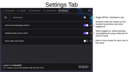
The Settings Tab provides environment and interaction preferences.
- Passthrough — Toggle between AR (mixed reality passthrough) and VR modes. Available on standalone headsets only.
- Left-handed mode — Set the dominant hand to left.
- Allow two-handed grab rotation — When toggled off, restricts molecule rotation to one-handed movements only.
- Enable far grab snap-to-hand — When toggled on, allows pointing at and grabbing far-away molecules to zoom them to your hand.
- Show other user Avatars — Hide or show avatar representations for each user in the scene.
- Enable interface sounds — Toggle sounds on and off when interacting with menu items.
The bottom of the Settings Tab displays the currently logged-in username and the Nanome version number, along with a Log Out button for switching Nanome accounts.
Grid
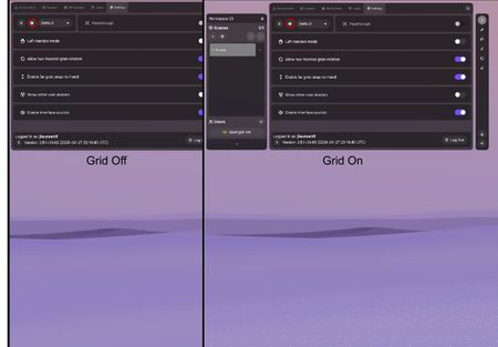
The grid icon at the top of the Settings Tab toggles the environment floor grid on and off.
Day/Night Mode and Themes
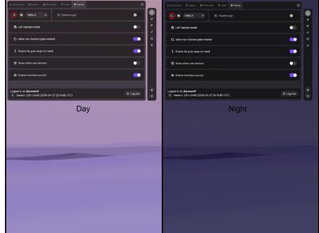
The sun and moon icon at the top of the Settings Tab switches the environment between Day and Night lighting.
The dropdown beside it selects the environment theme. Seven themes are available: Default, Arctic Cyan, Aurora Green, Black & White, Gold Orange, Island, and Pure Black. Each theme can be used in either Night Mode or Day Mode.